SiteSpect Marketing Materials
Marketing Materials
Branding
This is a collection of marketing materials I designed for SiteSpect, a tech platform focused on experience optimization.
Marketing Materials
Branding
This is a collection of marketing materials I designed for SiteSpect, a tech platform focused on experience optimization.
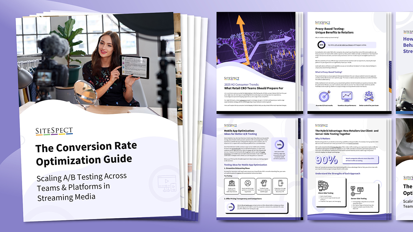
The purpose of these documents was lead generation, positively boosting brand perception, and increasing brand awareness. To this end, the documents communicated complex information clearly while visually emphasizing high-impact takeaways and CTAs.
SiteSpect’s target audience includes companies across various industries who are focused on enhancing the customer experience they offer. Sitespect achieves this through data and adaptive strategies such as A/B testing. Because of this, I heavily implemented SiteSpect’s purples and oranges into the documents, colors that are associated with wisdom, optimism, and success. I also incorporated flowing organic shapes and linework, subtly referencing data flow and adaptability. I used these principles to create a templatized design system, allowing me to efficiently produce consistent marketing materials at scale.