Möve Social Graphics
Social Graphics
Branding
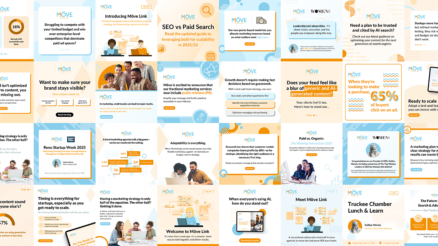
This is a collection of social media graphics I designed for Möve Marketing, an award-winning marketing agency.
Social Graphics
Branding
This is a collection of social media graphics I designed for Möve Marketing, an award-winning marketing agency.
The purpose of these graphics was lead generation and increasing brand awareness. To this end, the graphics employed simple yet attractive designs to capture attention and promote engagement, visually emphasizing client-oriented messaging.
Möve Marketing’s target audience is growing businesses and startups, clients that typically foster an energetic and optimistic outlook. Because of this, I heavily implemented Möve’s orange and blues into the graphics, colors that are associated with enthusiasm, optimism, and success. I also incorporated simple geometric accents to create a friendly and approachable feel. I used these principles to create a templatized design system, allowing me to efficiently produce consistent graphics at scale.