Möve Marketing Materials
Marketing Materials
Branding
This is a collection of marketing materials I designed for Möve Marketing, an award-winning marketing agency.
Marketing Materials
Branding
This is a collection of marketing materials I designed for Möve Marketing, an award-winning marketing agency.
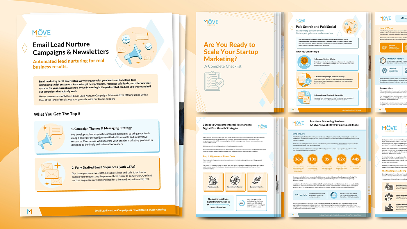
The purpose of these documents was lead generation, positively boosting brand perception, and increasing brand awareness. To this end, the documents communicated complex information clearly while visually emphasizing high-impact takeaways and CTAs.
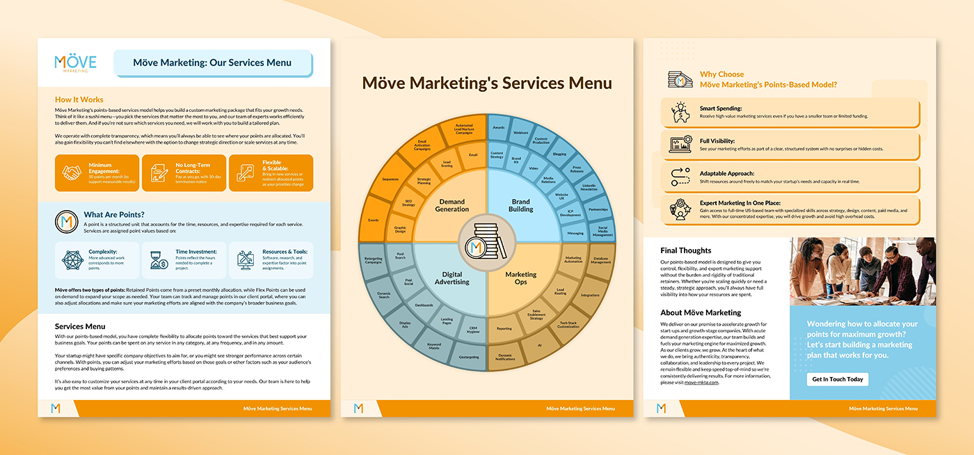
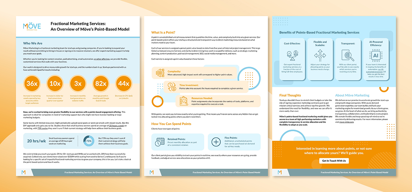
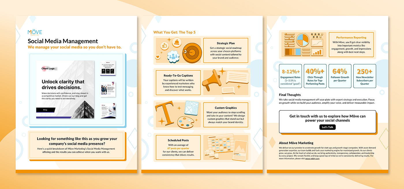
Möve Marketing’s target audience is growing businesses and startups, clients that typically foster an energetic and optimistic outlook. Because of this, I heavily implemented Möve’s orange and blues into the documents, colors that are associated with enthusiasm, optimism, and success. I also incorporated simple geometric accents to create a friendly and approachable feel. Additionally, I created custom illustrative elements to articulate complex ideas in unique, on-brand ways. I used these principles to create a templatized design system, allowing me to efficiently produce consistent marketing materials at scale.