Home

About

Contact

Noah Benjamin Jones Design

Noah Benjamin Jones Design

Explore

Information Design & Data Visualization

Information Design

Infographic Design

Technical Communication

Data Visualization

Educational Graphics

Overview

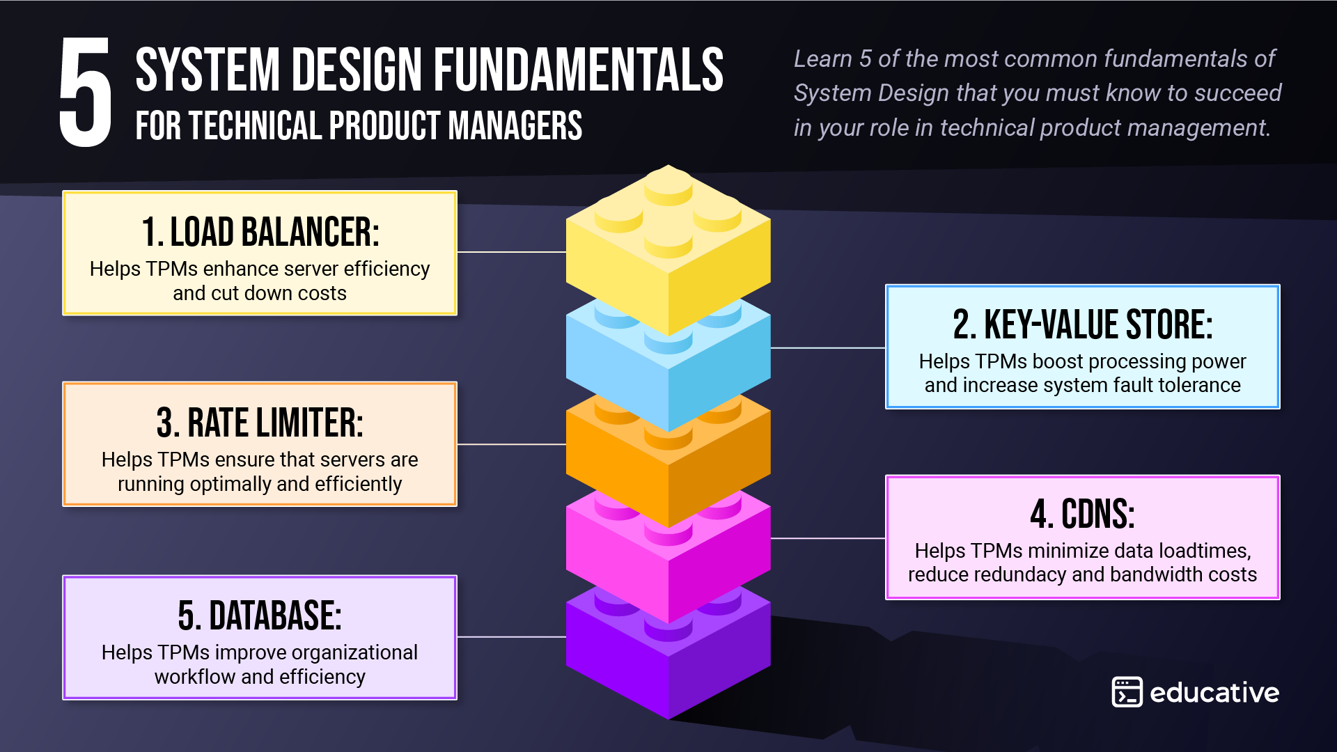
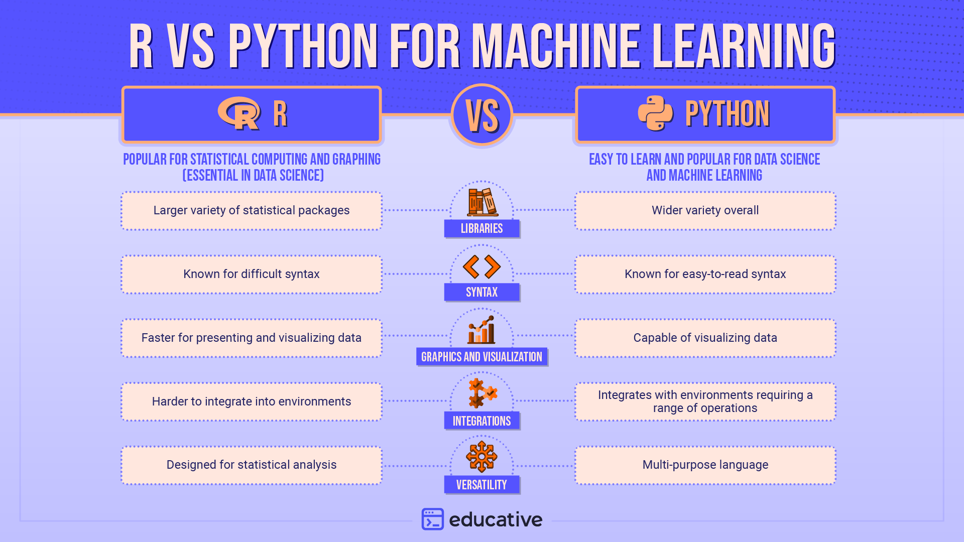
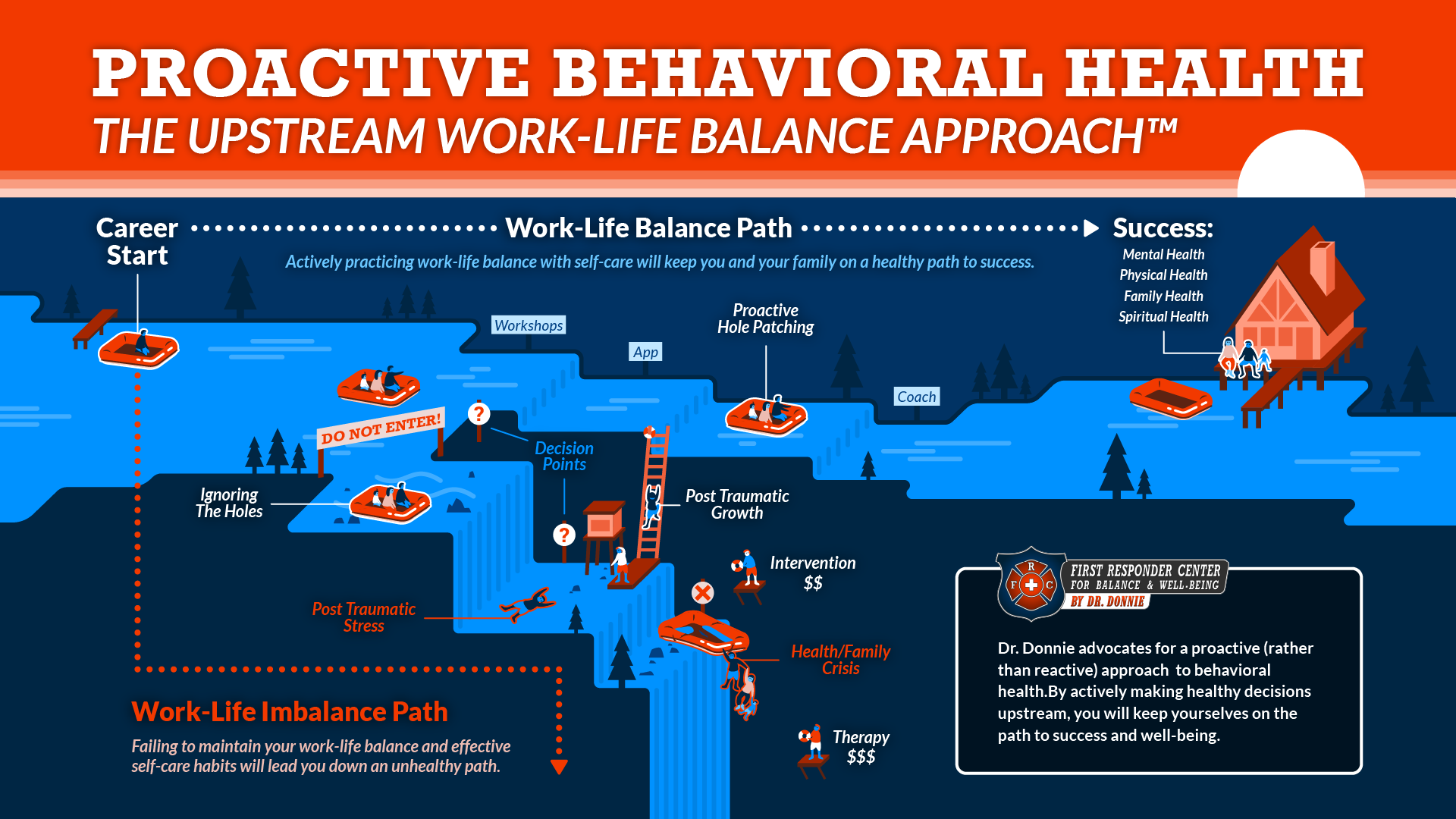
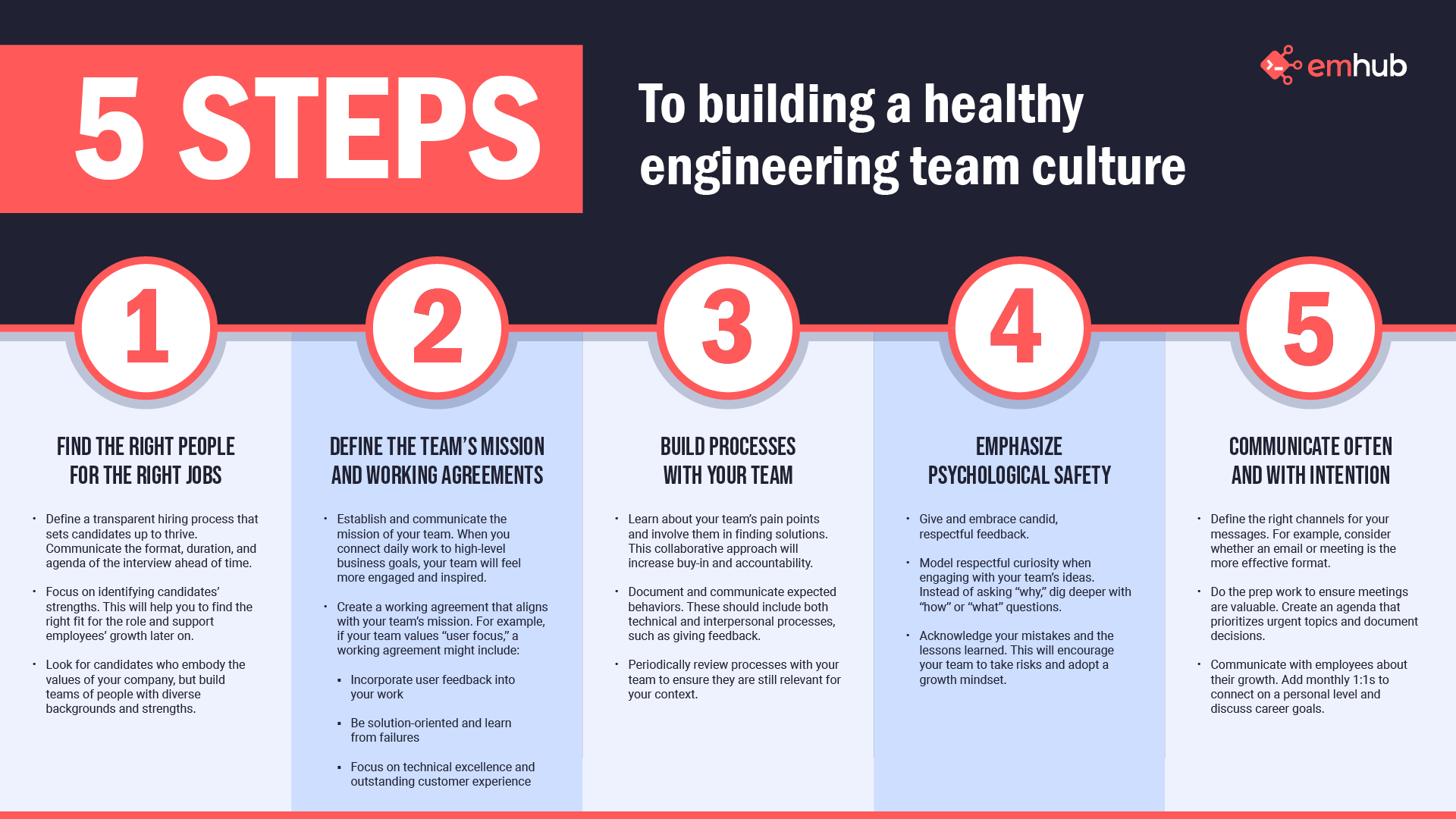
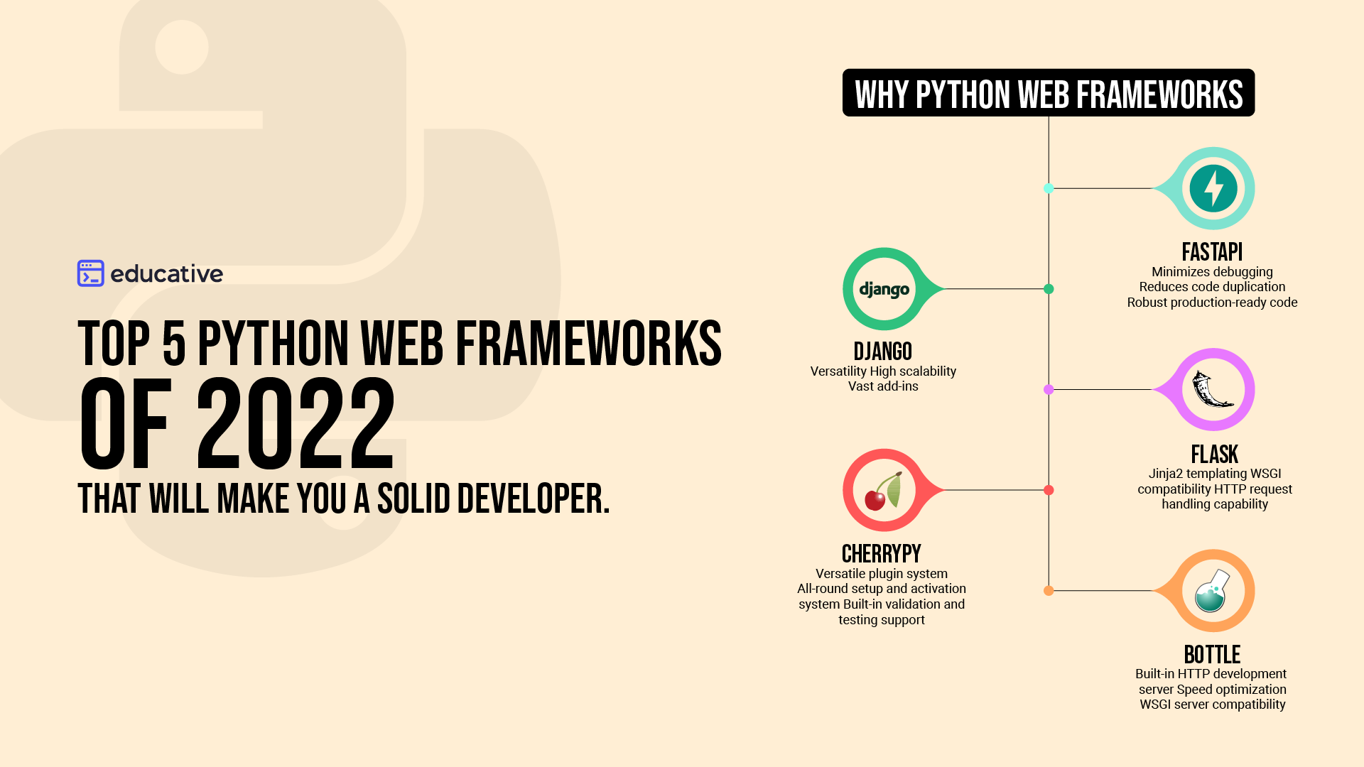
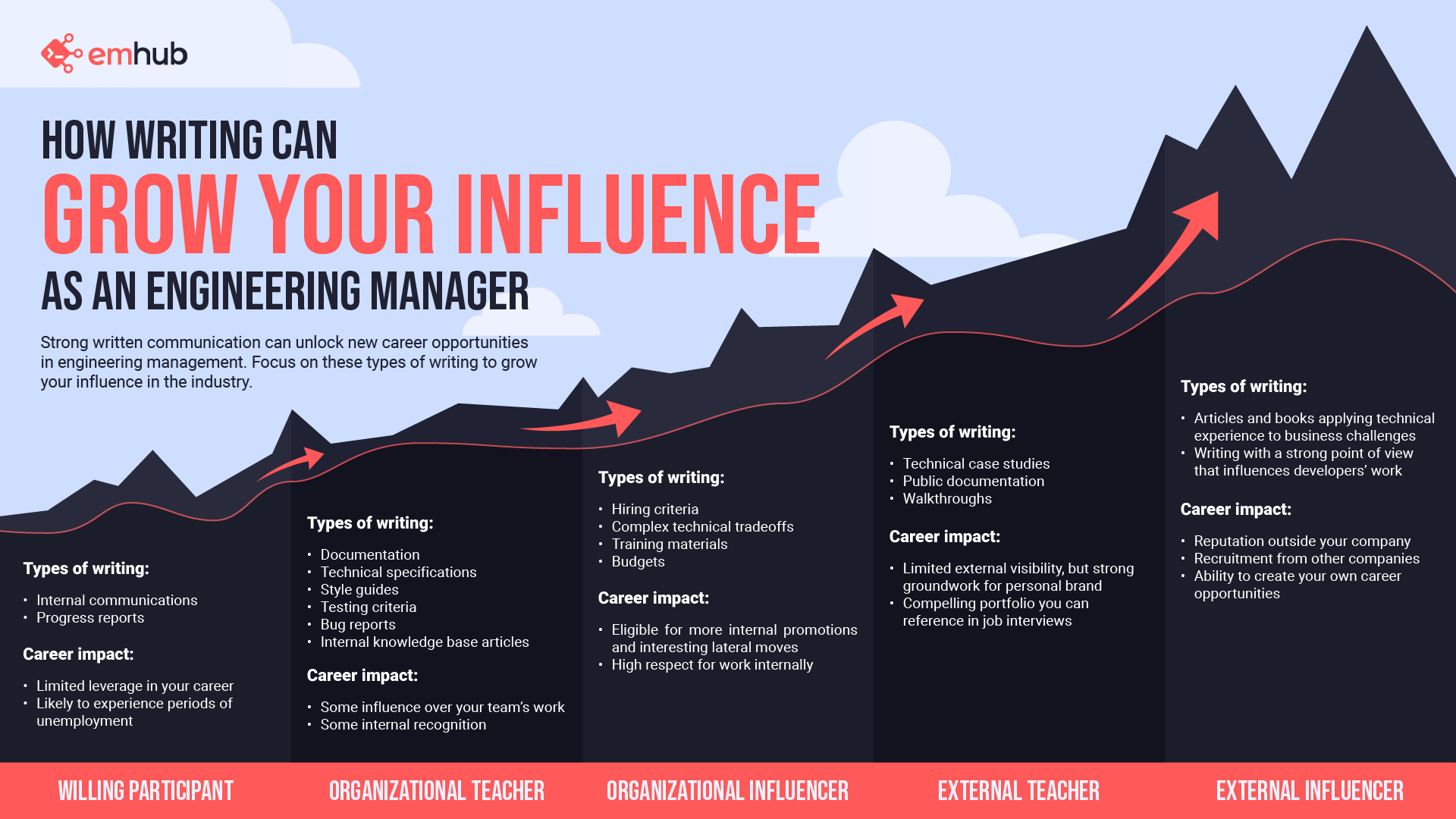
This collection of infographics was created to communicate complex ideas in a way that is visually engaging and easy to understand. The graphics were designed for educational and professional audiences, including developers, engineering leaders, and professionals exploring behavioral health and team dynamics.

Each piece focuses on translating structured information into clear visual frameworks that help readers quickly grasp relationships, comparisons, and processes. Through hierarchy, visual metaphors, and structured layouts, these designs simplify complex topics while maintaining accuracy and clarity.

Design Challenge

Many technical and conceptual topics are difficult to understand when presented through text alone. Developers, engineering managers, and professionals often need to quickly interpret information such as system architecture, programming language differences, team management practices, or behavioral health frameworks.

The challenge was to transform dense information into visual structures that allow audiences to scan, compare, and understand key concepts quickly. Each infographic required careful consideration of hierarchy, pacing, and visual storytelling to ensure that readers could follow the information intuitively.

Design Approach

Each infographic was built around a clear visual structure designed to guide the reader through the information step-by-step.

Complex concepts were broken into logical groupings, allowing readers to quickly understand relationships between ideas. Visual metaphors, comparison layouts, and sequential frameworks were used to support comprehension while maintaining visual engagement.

Typography, color, and iconography were carefully applied to reinforce hierarchy and help readers navigate the information without feeling overwhelmed. The goal was to create visuals that support learning while remaining visually clear and approachable.

The Infographics

This case study includes a series of educational and conceptual infographics designed to communicate complex ideas through visual storytelling.Topics include:

• distributed system architecture fundamentals
• programming language comparisons for machine learning
• data flow within React-Redux application architecture
• engineering leadership and communication frameworks
• technical writing as a tool for professional influence
• proactive behavioral health and work-life balance strategies

Each piece uses structured layout systems, visual metaphors, and consistent hierarchy to transform complex subject matter into accessible visual explanations.

System Design Fundamentals

An educational infographic visualizing the five core components of distributed system architecture for developer learning.

R vs Python for Machine Learning

A side-by-side infographic explaining the strengths and tradeoffs of R and Python for machine learning workflows.

Proactive Behavioral Health: The Upstream Work-Life Balance Approach

A narrative infographic illustrating how proactive behavioral health decisions can prevent long-term work-life imbalance and support sustained well-being.

5 Steps to Building a Healthy Engineering Team Culture

A process-driven infographic designed to help engineering leaders communicate core principles for building healthy team culture.

Top Python Web Frameworks

A comparison infographic highlighting key Python web frameworks and their capabilities for backend development.

Grow Your Influence as an Engineering Manager

A visual framework illustrating how different forms of technical writing contribute to increasing influence and career growth in engineering leadership.

Highlighted Skills

Information Design, Data Visualization, Infographic Design, Visual Hierarchy, Layout Systems, Technical Communication, Iconography, Visual Storytelling and Educational Design