5th Line Social Graphics
Social Graphics
Branding
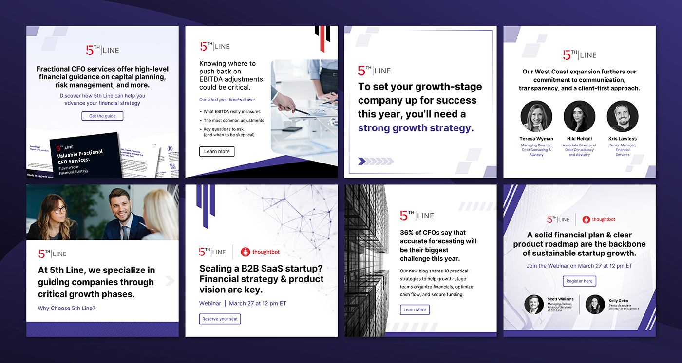
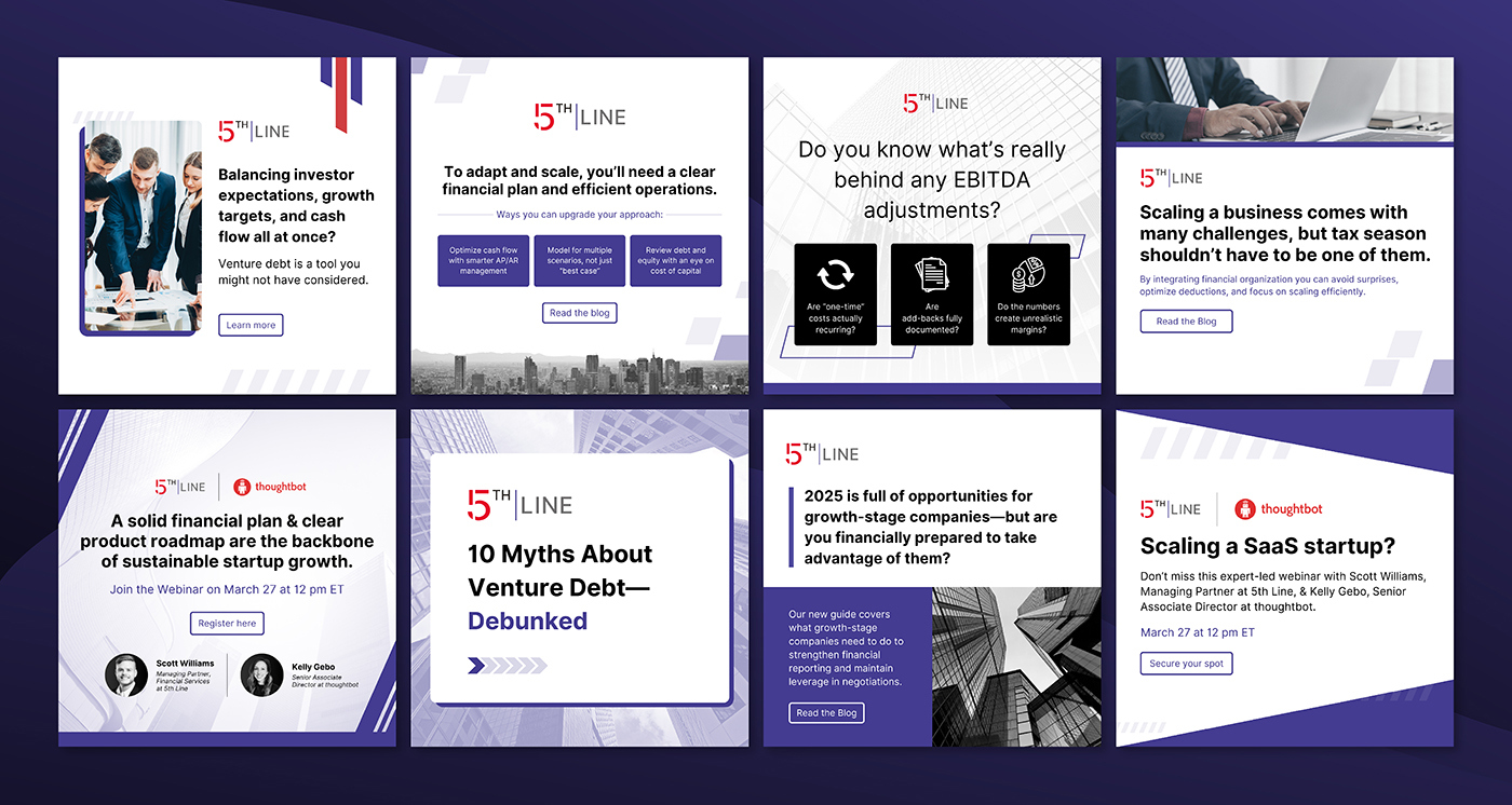
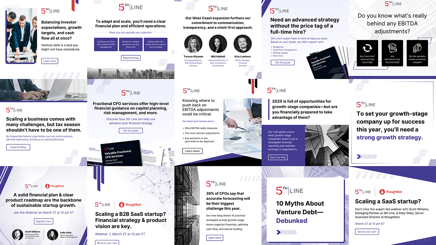
This is a collection of social media graphics I designed for 5th Line, a financial services and technology provider serving growth-stage companies.
Social Graphics
Branding
This is a collection of social media graphics I designed for 5th Line, a financial services and technology provider serving growth-stage companies.
The purpose of these graphics was lead generation and increasing brand awareness. To this end, the graphics employed simple yet attractive designs to capture attention and promote engagement, visually emphasizing client-oriented messaging.
5th Line’s target audience is companies that need support financially. It was important for 5th Line to be perceived as both trustworthy and innovative. Because of this, I kept the graphics high contrast, while introducing splashes of 5th Line’s blue and red, symbolizing trust, power, and action. I also incorporated sharp, angular shapes and high contrast elements to keep the graphics feeling sharp and allude to the innovative solutions that 5th Line generates. I used these principles to create a templatized design system, allowing me to efficiently produce consistent graphics at scale.